


People have been talking a lot about cover art lately, what with all the Best-Of Lists floating around this time of year. When it comes to cover art, I’ve found that people are shockingly opinionated. Maybe you can’t judge a book by its cover, but you can still judge the cover. Sometimes cover controversy is about larger issues, but more often than not it’s pure aesthetics: what looks good, what looks really bad?
I can usually guess when our production and editorial departments are meeting about a cover because they stay in the conference room for a looooong time. For a couple of reasons, I think children’s and YA covers can be more challenging to design than adult covers. First off, they sometimes have to appeal to a fairly wide age range, and the difference between a 6-year-old and an 11-year old is not the same as the difference between a 35-year-old and a 40-year-old. Older kids don’t want a book that looks babyish, and younger kids don’t want a cover that looks old. Plus, boys don’t want to read “girl books” and vice versa. Not to mention teenagers, who–as usual–have their own set of demands.
With so many factors, it’s a thin line between appealing to the widest possible audience and appealing to no one at all. What makes a good book cover, then?
Simplicity?

Mystery?

Food?

I don’t know, but like a certain something else, I think when it comes to a good book cover, you know it when you see it. Shelf Awareness always asks authors during interviews, “What book have you bought for the cover?” Here’s my answer:


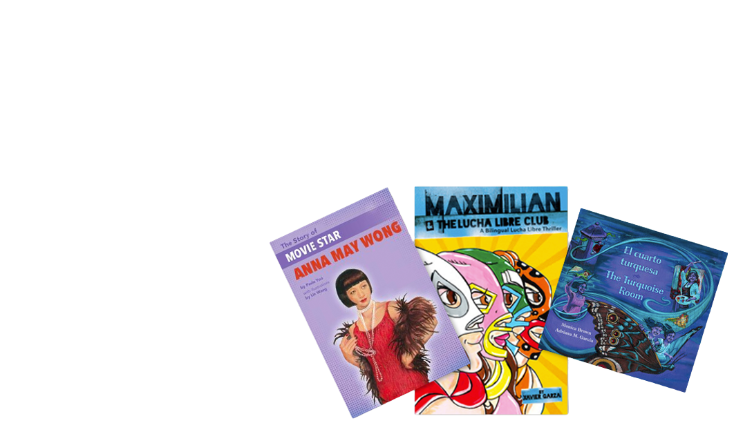
What books have you bought for the covers?